Starting as one of only 3 designers at BuzzFeed in 2011, I've had a very broad range of experience in design, development, and product management over the past 4 years.
During this time, BuzzFeed grew from a single platform content aggregation website, to a multi-platform media company. Much of this growth was made possible by the proliferation of content on the mobile web. In my early tenure at BuzzFeed, there were no dedicated designers or developers focused on mobile, which, at the time, accounted for less than 30% of total web visits.
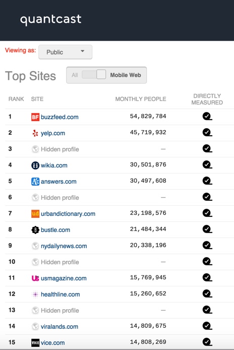
As of February 2016, BuzzFeed is the largest mobile website in the US as ranked by Quantcast.
Seeing the importance of the mobile web for the future of viral media content, where traffic is frequently driven by users sharing links to social media, I focused on designing and developing mobile web experiences. Mobile web traffic to BuzzFeed.com has increased by a factor of 10, to well over 100 million monthly users in 2016.
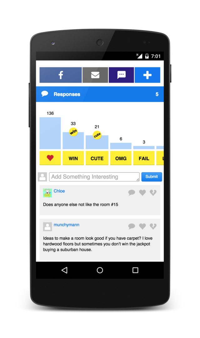
Users who react and comment on articles are valuable to the BuzzFeed ecosystem, but most users don't react or comment. Previous versions of article pages listed recent reactions and comments in long lists, spanning several pages. This reduced average user engagement with related article content below this section. I designed a "reaction graph" where users can get information about community behavior and react inline, without scanning through dozens of list entries. This concept has since been expanded across the BuzzFeed.com site.
Working closely with product and engineering, I designed and implemented dozens of features and ran myriad a/b tests.
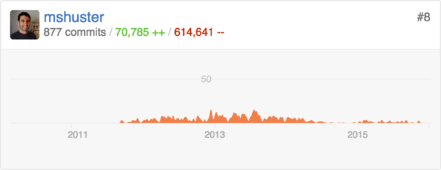
I was deeply involved with building and maintaining BuzzFeed's mobile web platform.
Even little details can mean a great deal. Here I tweaked the image loading animations to align them to patterns familiar to Android users. Only users visiting from Android devices would be shown the animation.
As BuzzFeed's mobile presence grew, so did the codebase and our mobile website performance began to deteriorate. I was quick to identify and address page performance issues, and was a founding member of an internal group initially tasked at improving web performance, and is now responsible for improving speed and performance across all products.
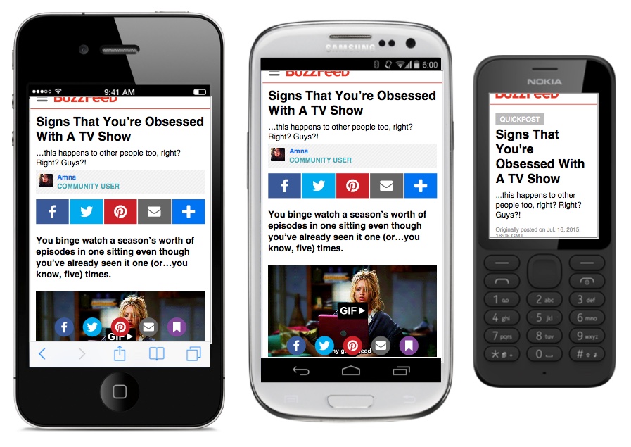
I led efforts to ensure that BuzzFeed's mobile pages worked across a variety of networks and devices.
Performance is an inextricable part of the user experience. Understanding this, I joined a team of developers to prototype an ultra-optimized version of the mobile website as a project for BuzzFeed Hack Week 2015. It was so successful that it was integrated back into the main codebase and now forms the foundation of our mobile web architecture.
"BuzzLite is a lightweight version of BuzzFeed that is designed to be accessible to users with limited mobile network capability and device performance... We were able to build a prototype that took all of these limitations into account and deliver an experience that allows users of all kinds to enjoy BuzzFeed content... The resulting pages completely load four times faster than the current BuzzFeed mobile experience." [33 Incredible Projects From BuzzFeed Hack Week]
“It is clear to see that Mark cares a lot about the very small details that make up BuzzFeed's different mobile platforms, whether its the mobile app or mobile web. He is aware of how things work between the two ecosystems, and their appropriate data infrastructures.”
-Android Developer
As part of a small team of designers in 2011, I was responsible for the design work on all of BuzzFeed's mobile platforms, including web, iOS, and Android, on both phones and tablets. As the team grew, I was able to focus on design for Android and helped to build an award-winning news and entertainment app.
I designed BuzzFeed's Android apps, which were recognized by Google in 2013 and 2014 as among the best apps in the Play Store.
My work on the BuzzFeed app design update for Android L (5.0) was recognized again by Google at I/O 2015 as Best-In-Class Android Design.
For the launch of Android L (5.0) I redesigned the BuzzFeed app using Material Design. The incorporation Material Design into the BuzzFeed design language was a long-term project that touched every aspect of the app interface. Our relaunch was featured in a blog post by Google about designing great Android L apps.
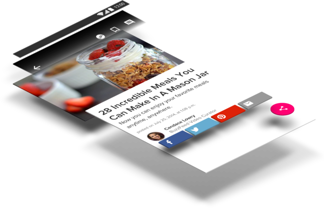
Material Design theory was thoroughly applied from the bottom up (and the top down).
“Mark paved the way for our L release by doing all of the design work. He adhered to Google's new Material Design specifications while still giving our app a very BuzzFeed like feel.”
-Android Developer
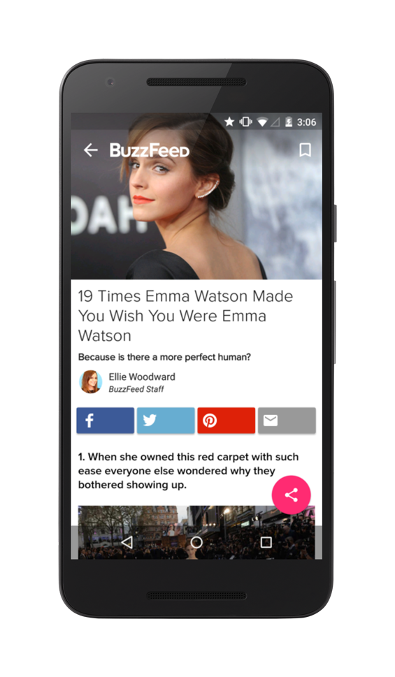
Full-bleed imagery, floating action buttons, dynamic type heirarchy, bright colors, meaningful animation. Users loved our Android L release.
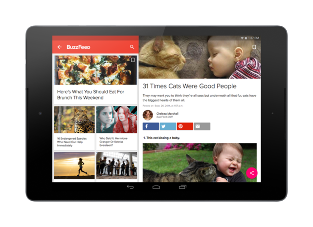
Incorporating Material Design touched every aspect of the Android user experience across all devices.
The BuzzFeed app has maintained a 4.2+ rating on the Play Store for the past 3+ years, which is amongst the highest ratings amongst media companies.
“Our L release has been a big success with a lot of positive feedback from the community. And since the UI and functional design accounts for most of the user experience, Mark's work is a huge reason for this success.”
-Android Developer
I've now spent many years as an Android designer and have had the opportunity on numerous occasions to speak publically about design for the Android platform. Some of the recordings are available online.
I've been priviledged to be a part of a dozens of other BuzzFeed projects, small and large spanning across various teams and platforms.
QuizChat by BuzzFeed has been able to reach a much larger audience on Android than on iOS. I designed the UX and UI for Material Design from the original iOS version. This is a prototype for the shared element transitions.
Every complex interaction goes through several phases of prototyping, to ensuring that animations and their timings feel right.
I was part of a team of designers and developers that created the Solid CSS framework and styleguide. Solid is an atomic CSS framework useful for quickly building websites adhering to BuzzFeed style standards.